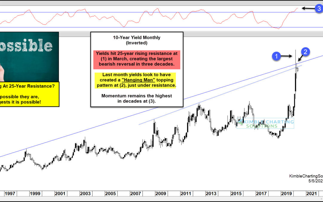
by Chris Kimble | May 6, 2020 | Kimble Charting
If treasury bonds aren’t on your radar, they should be. Many investors and mom and pops own treasury bonds, whether it be a retirement account or pension. Last month, I wrote an article about the potential for a reversal on the 30-Year US Treasury Bond by looking at...
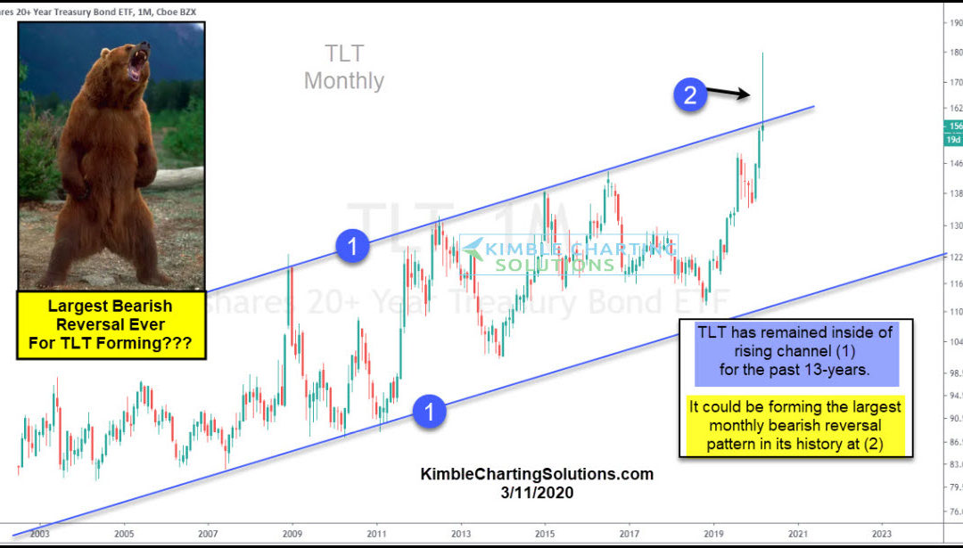
by Chris Kimble | Mar 13, 2020 | Kimble Charting
The financial markets are panicking and it’s producing some huge swings across asset classes. One asset that may be producing a monster reversal is treasury bonds (TLT). The flight to safe havens produced a sharp rise in the 20+ Year US Treasury Bond ETF (TLT)....

by Chris Kimble | Sep 11, 2019 | Kimble Charting
U.S. Treasury Bond Yields – 2, 5, 10, 30 Year Durations The past year has seen treasury bond yields decline sharply, yet in an orderly fashion. This has spurred recession concerns for much of 2019. Needless to say, it’s a confusing time for investors. In today’s chart...
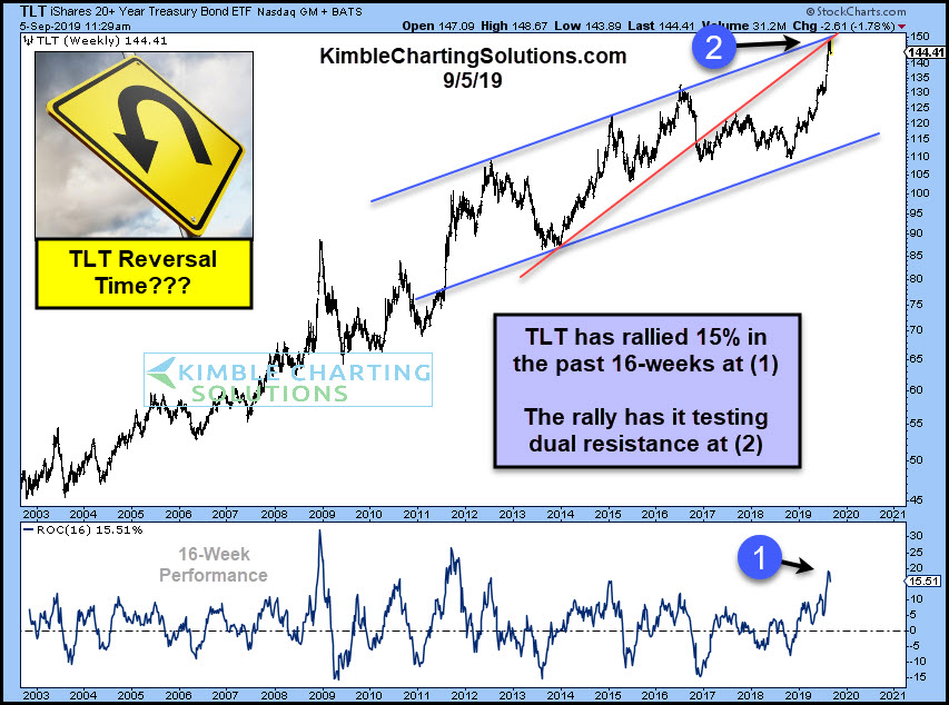
by Chris Kimble | Sep 5, 2019 | Kimble Charting
Government bonds have experienced a massive rally over the past 4-months. Could the bond rally be over or is it ready to take a breather? Possible! Government Bond ETF (TLT) has rallied over 15% in the past 16-weeks at (1). This rally is the 3rd largest 16-week rally...
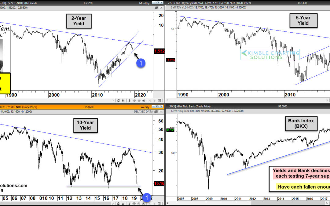
by Chris Kimble | Aug 30, 2019 | Kimble Charting
In the past 5-weeks, 10-Year Yields have declined 26%, 5-year yields are down 24% and 2-year yields are down 17%. Is there more of a decline in yields to come? How would stocks react if yields rally off support? Could bank start reflecting relative strength if yields...
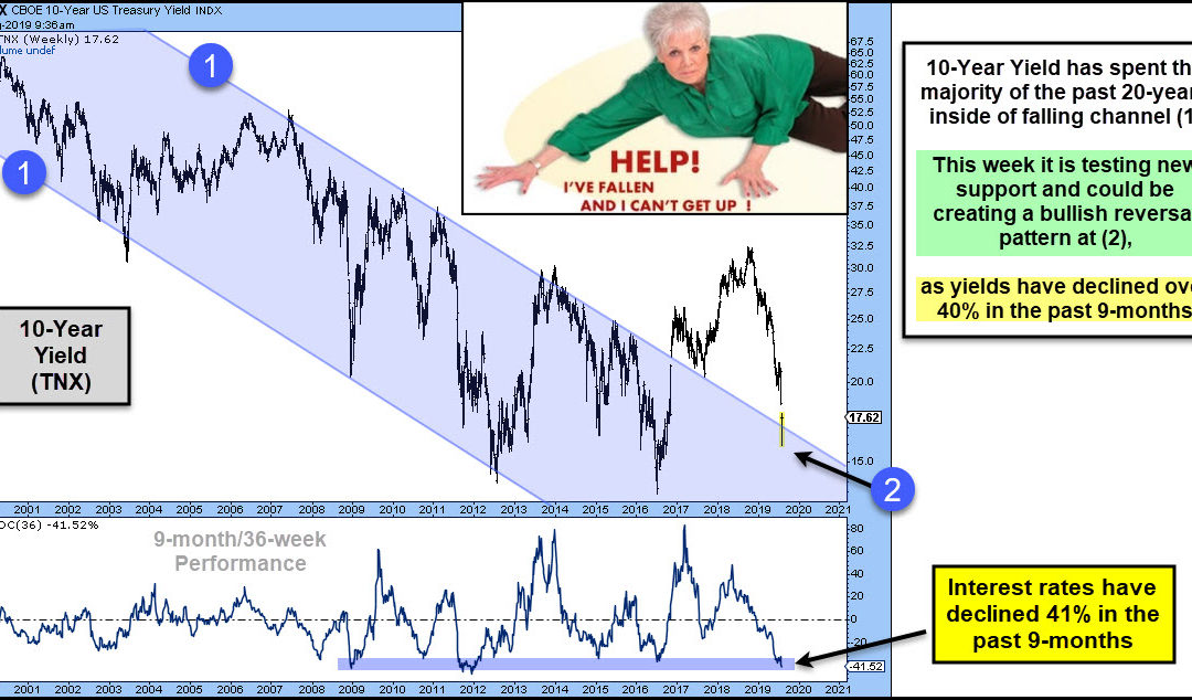
by Chris Kimble | Aug 8, 2019 | Kimble Charting
Interest rates have declined over 40% in the past 9-months. Could they be near a short-term low? Stocks most likely hope so. This chart looks at the yield on the 10-year note (TNX) over the past 20-years. The majority of the past couple of decades rates have declined...
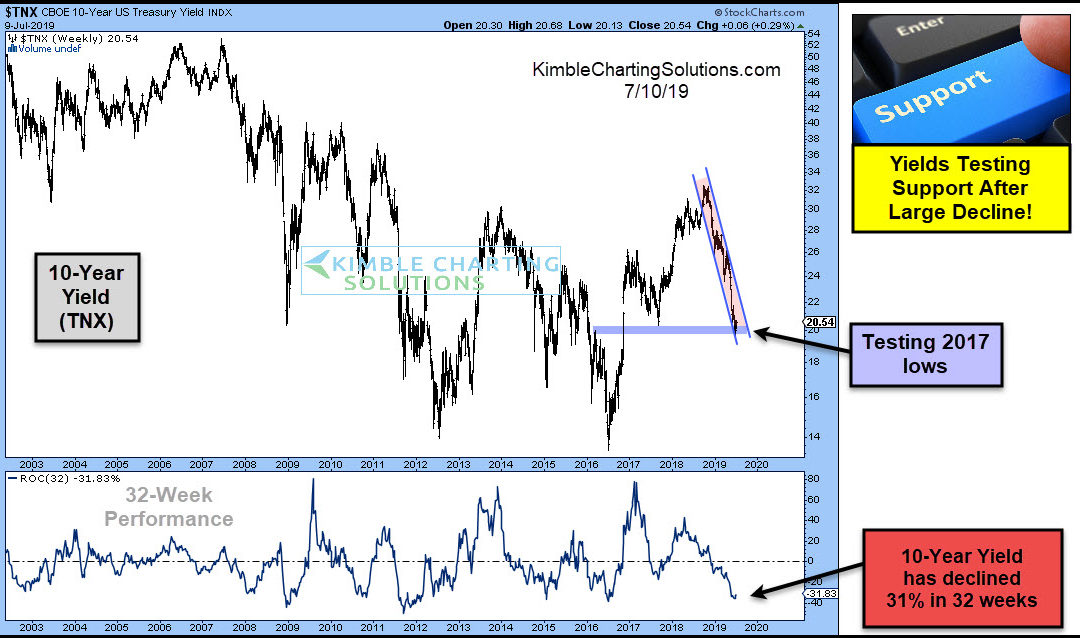
by Chris Kimble | Jul 10, 2019 | Kimble Charting
Will the Fed lower interest rates today? They could if they follow the yield on the 10-year note over the past 32-weeks! This chart reflects that the yield on the 10-year note (TNX) has declined 31% in the past 32-weeks. This decline has yields testing 2017 lows while...
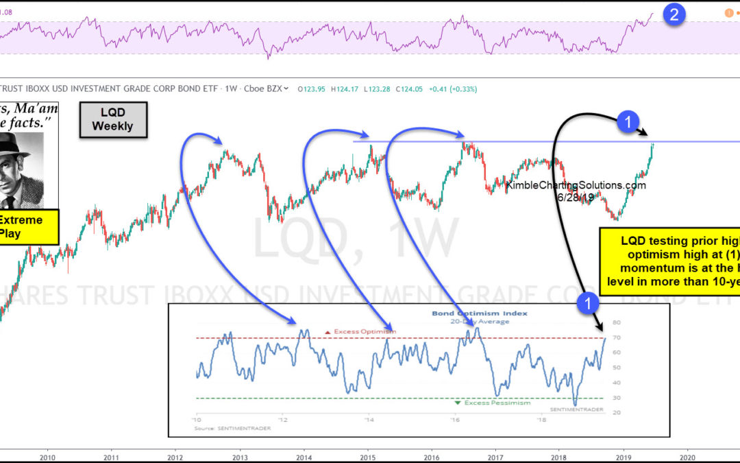
by Chris Kimble | Jun 28, 2019 | Kimble Charting
Are investment grade bonds peaking? Some conditions suggest its possible, says Joe Friday! This chart looks at Investment Grade Bond ETF (LQD) over the past 10-years. LQD has moved sharply higher since the lows in December of 2018. The rally has LQD testing its 2015...
