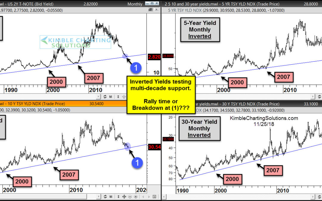
by Chris Kimble | Nov 25, 2018 | Kimble Charting
This 4-pack looks at short to long-term interest rates over the past few decades with a little twist, each chart is inverted (yields are upside down). Each chart reflects that yields are testing multi-decade support at each (1). These support lines were tested back in...
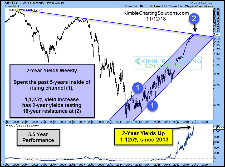
by Chris Kimble | Nov 12, 2018 | Kimble Charting
CLICK ON CHART TO ENLARGE This chart looks at the yield of the 2-year note and its 5.5-year performance since 1999. The 2-year yield looks to have double bottomed in 2013 and since then it has been swiftly moving higher inside of rising channel (1). The 2-year yield...
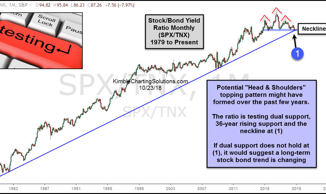
by Chris Kimble | Oct 24, 2018 | Kimble Charting
CLICK ON CHART TO ENLARGE This chart looks at the S&P 500/10-Year Yield ratio over the past 40-years, on a monthly basis. The ratio started creating a series of highs lows in the early 1980’s, reflecting that stocks were moving up faster than yields. Over...
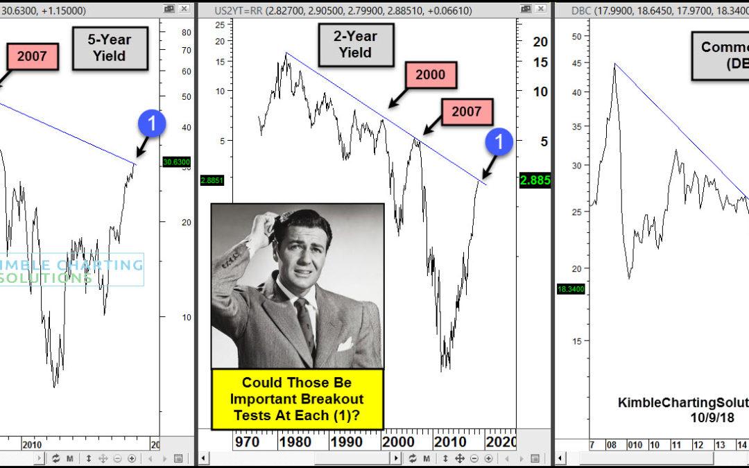
by Chris Kimble | Oct 10, 2018 | Kimble Charting
CLICK ON CHART TO ENLARGE This chart looks at Commodity ETF (DBC) over the past 12-years as well a 2 & 5-Year yields over the past couple of decades. DBC peaked in 2007 and has created a series of lower highs ever since. The rally over the past couple of years has...
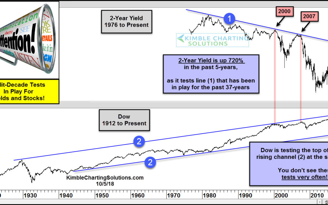
by Chris Kimble | Oct 9, 2018 | Kimble Charting
At what point does the rise in treasury yields (and interest rates) matter to the economy and stock market? Today’s chart looks at the past 4 decades of the 2-year treasury note yield versus the stock market (the Dow Jones Industrial Average). As you can see in the...
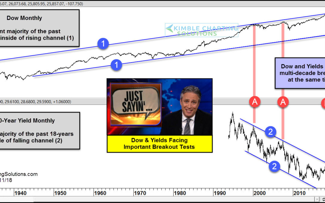
by Chris Kimble | Sep 11, 2018 | Kimble Charting
CLICK ON CHART TO ENLARGE This chart looks at the Dow Jones Industrials Average and the Yield on the 10-year note on a monthly basis for several decades. The top chart looks at the Dow since 1927 and the bottom chart looks at yields since 1994. The Dow has spent the...
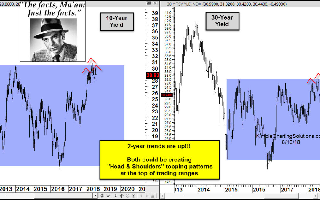
by Chris Kimble | Aug 10, 2018 | Kimble Charting
CLICK ON CHART TO ENLARGE The trend for interest rates over the past couple of years is clearly higher, as yields have risen sharply! The 10-year yield trend over the past 6-years is flat and the same can be said for the 30-year yield over the past 3-years, as each is...
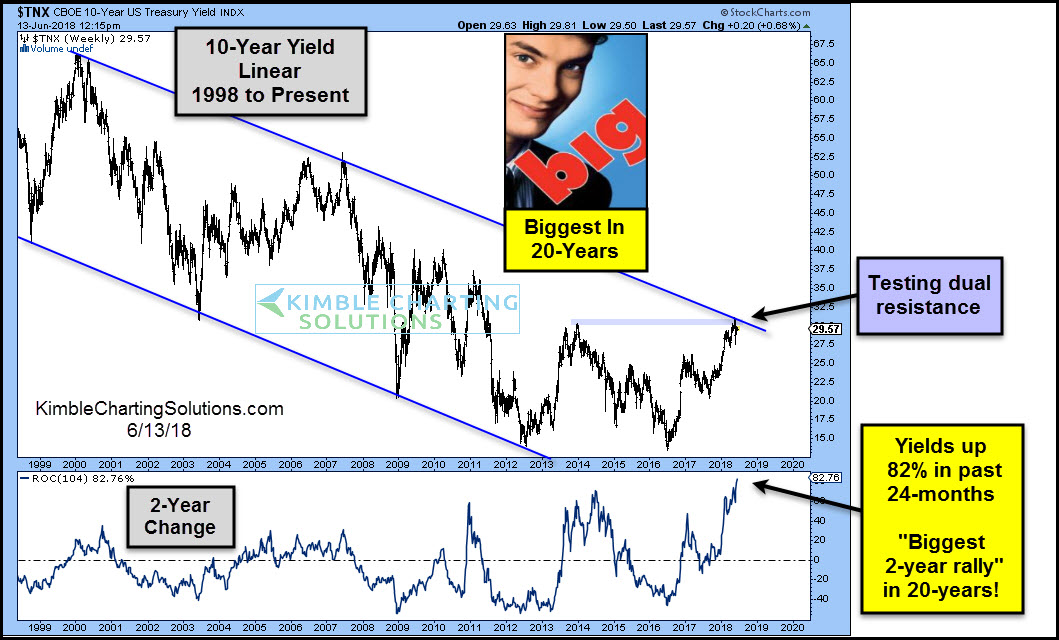
by Chris Kimble | Jun 15, 2018 | Kimble Charting
With the Federal Reserve in interest rate “hike” mode, the market is on edge about the speed with which rates will rise. Rates have been rising at a pretty steady clip over the past couple of years… and apparently, it’s getting investors attention! In fact, the past...
