by Chris Kimble | Oct 18, 2023 | Kimble Charting
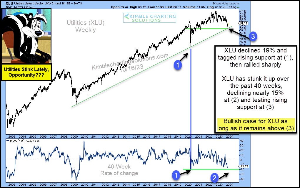
It’s been a tough environment for the Utilities Sector. The ETF (XLU) has underperformed for months and really stunk it up in recent weeks. Looking at the chart below, you can see that XLU declined 19% in 2020, tagging its uptrend line at (1) before rallying sharply....
by Chris Kimble | Mar 3, 2023 | Kimble Charting
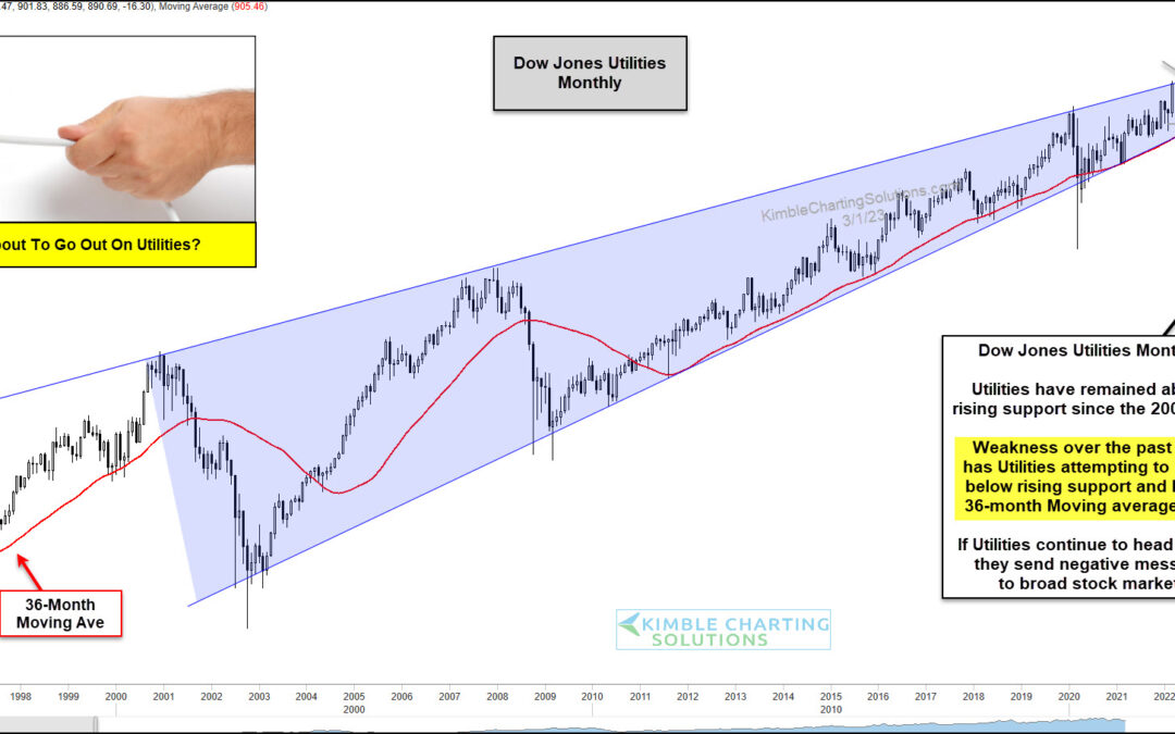
The Dow Jones Utilities Average has enjoyed a 20-year bullish rising price trend. But a recent multi-month sell-off has bulls on the ropes and wondering if the lights are about to go out on utilities. Today’s chart is a long-term “monthly” chart of the Dow Jones...

by Chris Kimble | Feb 22, 2023 | Kimble Charting
Utilities stocks have been in a long-term uptrend over the last 20 years. This tremendous trend can be seen in the “monthly” chart of the Dow Jones Utilities Index below. Note, however, that the rising trend channel is quite wide. And within this wide trend channel...
by Chris Kimble | Mar 5, 2019 | Kimble Charting
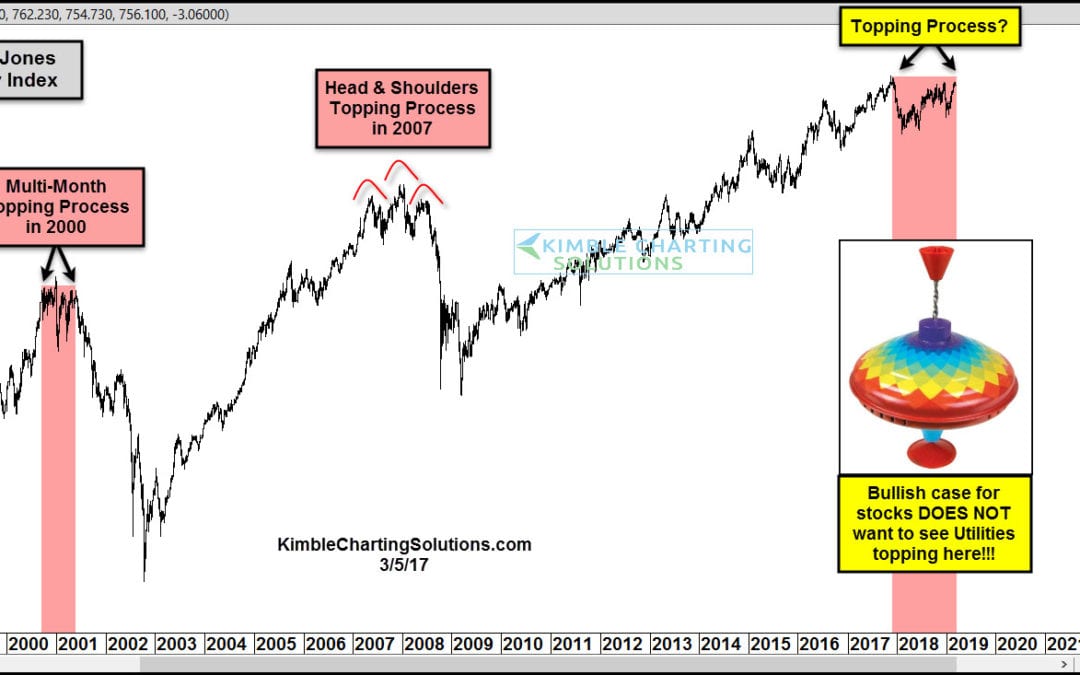
In 2000 the Dow Jones Utility index spent around 7-months creating a topping process. The S&P 500 had declined for nearly 12-months before the waterfall decline in Utilities got started. In 2007, Utilities spent nearly 12-months creating a topping process. The...

by Chris Kimble | Feb 24, 2018 | Kimble Charting
One of Mark Twain’s famous quotes is “The reports of my death have been greatly exaggerated.” It’s very easy to find people saying the death of the 25-year bond market has already taken place. Has the death of the bond bull actually happened?...

by Chris Kimble | Feb 10, 2018 | Kimble Charting
Market declines and under performance can create opportunities. The table below looks at performance of the S&P 500 sectors over the past 90-days. As you can see the S&P has pretty much went nowhere, yet two different sectors have been hit hard! CLICK ON CHART...

by Chris Kimble | Jan 10, 2018 | Kimble Charting
Utilities ETF XLU has had a rough go of it the past two months! Below compares XLU to the S&P 500 over the past year- CLICK ON CHART TO ENLARGE Sometimes Utilities are viewed as interest-sensitive assets. XLU was keeping pace with the S&P over the past year...

by Chris Kimble | Nov 29, 2017 | Kimble Charting
One of our favorite patterns during a bull market is the ascending triangle pattern, especially a multi-year ascending triangle. On October the 12th the Power of the Pattern shared the chart below, asking what would you do with this opportunity. See original post HERE...
