by Chris Kimble | Apr 17, 2013 | Kimble Charting
CLICK ON CHART TO ENLARGE The inset box reflects the three largest ETF’s in America. The second largest ETF has done poorly compared to SPY over the past 6 years and has formed a multi-year pennant pattern that is breaking down of late. Vanguard Emerging...

by Chris Kimble | Mar 19, 2013 | Kimble Charting
CLICK ON CHART TO ENLARGE The India ETF (EPI) formed a multi-month flag pattern, broke support and the rally over the past few weeks has it kissing the underside of the flag pattern as resistance at (1). If EPI fails to get back above resistance, I would want to...

by Chris Kimble | Dec 17, 2012 | Kimble Charting
Is Santa Claus bringing good cheer to the Emerging markets complex this year? The chart below reflects that BRIC ETF’s/Emerging markets are reflecting relative strength compared to the S&P 500 over the past 60 days. CLICK TO ENLARGE The 4-pack below reflects...

by Chris Kimble | Aug 30, 2012 | Kimble Charting
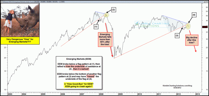
EEM broke below a flag pattern, tried to rally and failed as it “Kissed” the underside of resistance at (2) in the above chart and proceeded to decline 50% in a matter of months! Currently EEM broke below another flag pattern, then rallied up to the...

by Chris Kimble | Aug 17, 2012 | Kimble Charting
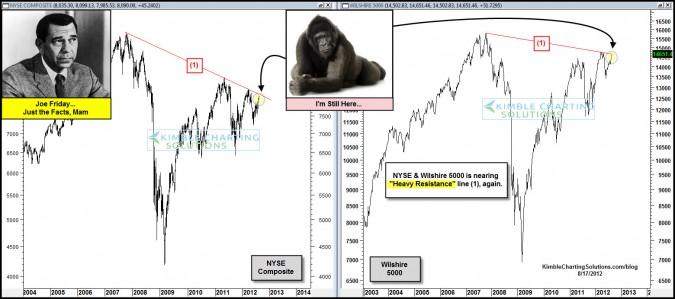
CLICK ON CHART TO ENLARGE Two of the broadest market index’s in the United States are back at resistance that has stopped their rallies over the past few years. Can these key markets push aside the 800 pound gorilla? Is the U.S. broad markets the only...

by Chris Kimble | Aug 14, 2012 | Kimble Charting
CLICK ON CHART TO ENLARGE Emerging Markets ETF (EEM) and European ETF (EFA) are up against key falling resistance lines. Is EEM creating a pattern just like it did back in 2007 at (1), as it kisses the underside of resistance at (2)? The chart below reflects that both...

by Chris Kimble | Jul 23, 2012 | Global Dashboard, Kimble Charting
Who broke down first? Shanghai Index or Europe? CLICK ON CHART TO ENLARGE Last May the Shanghai index first broke below key support, of a multi-year flag pattern at (1) in the chart above. The Power of the Pattern suggested at that time, its “global...

by Chris Kimble | Apr 26, 2012 | Kimble Charting
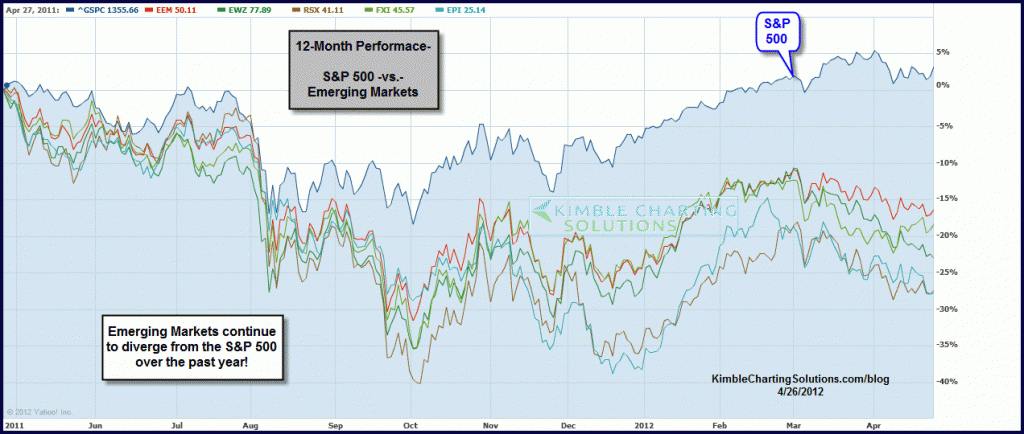
Its very easy to read research papers from Wall Street firms or hear money managers on CNBC tout that the real growth story continues to lie in the “Emerging Markets” arena. They may be correct in the longer-term, yet the Power of the Pattern...


